This isn’t an error state per se. But, it does highlight a form of extremely poor design that might as well be an error.
It all started when I wanted to read an article online. I happened to be actively browsing a website with quite a few outbound links, and I opened this link in a new tab, in the background.
Having finished the original article, I switched to read this opened-in-the-background article… and was very confused. Had I opened something wrong? What was it that I was reading?
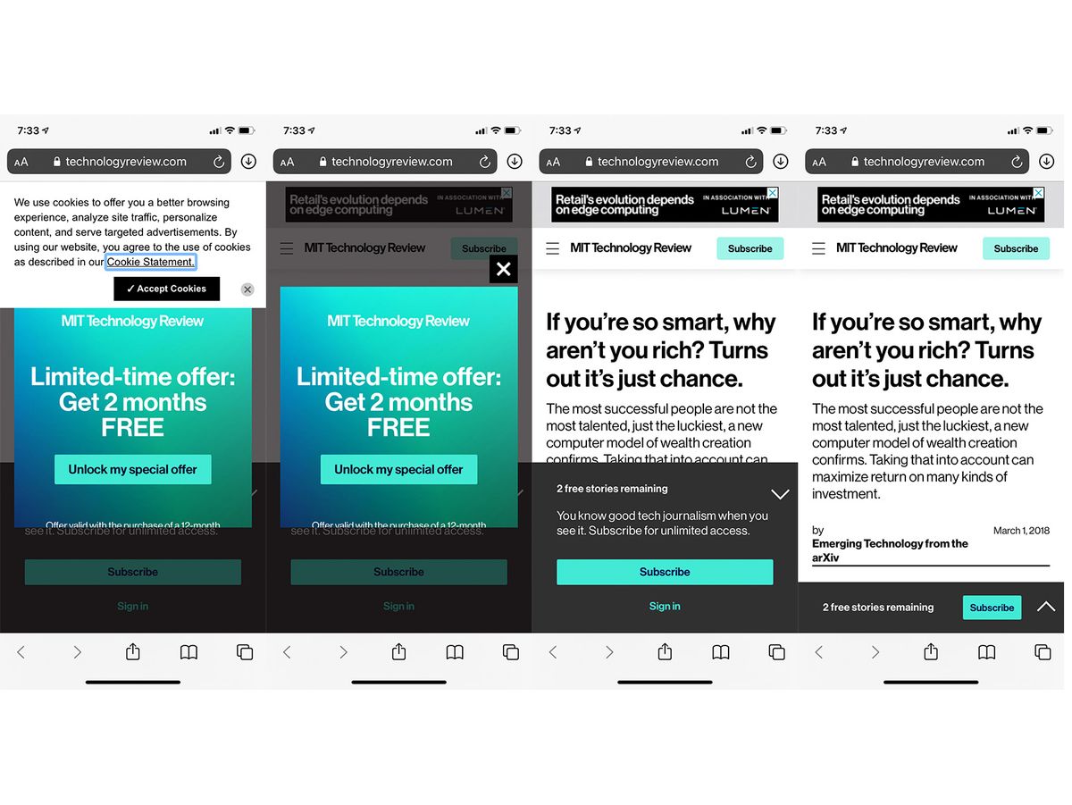
The url was fine, trusted, and reputable: MIT Technology Review. But I wasn’t sure what I was looking at. I couldn’t scroll, I couldn’t figure out what I was supposed to be reading.
One by one, I started closing the bloatware:
- First the
cookie statement, because I was hoping I’d at least see the article title behind it. No dice, I can’t see it behind the two advertisements. - Then the
limited time offermodal, because it was an overlay that I couldn’t bypass. - Ah! I see the title of the article, and three lines of the lead-in. But there’s another modal taking up 40% of the screen telling me that
I'm running out of free articles. It’s OK, MIT Tech Review. I don’t think I’ll be coming back nor do I read you regularly enough to care. This is a poor pattern: any random link I follow now tells me that I’m running out of articles and that I need to sign up to read more. Sorry Texas Monthly, who I clicked through to out of boredom, following a link. Sorry San Diego Gazette, National Chronicle of Higher Education, and a bunch of random sites. I’m not your target audience.
Four clicks into the article and I can read it. However,
- The last
"Only Two Free Stories Remaining"modal is simply minimized, not removed. If only I had know! I might not have clicked through… - There is still a pretty
big advertat the top of the screen that follows me as I scroll down. - As I keep reading, there are
mid-article adsthat take up the full screen and make it hard for me to scroll past without interacting with them. I resort to the “slingshot scroll”, slinging my page up so that it scrolls past the adverts on its own. I wonder how much of a publisher’s “engagement” KPIs comes from inadvertent interactions? - I’m still looking at two giant “
Subscribe” buttons in day-glo teal.
The MIT Technology Review is nominally a good magazine, but their digital edition’s UX is awful. Who would want to have to go through four clicks in order to read an article still punctuated by adverts? It is adversarial in its antagonism of the reader, taunting both the reader and the writer that the content is just an excuse to reach a targeted, specifically-defined-interest audience. (I’ve worked in the editorial space long enough to know this is more likely true than not).
And they’re not the only ones. Medium used to be an awful offender as well: similar cookie message, then prompts for me to register or log in, followed by new prompts to download the app, then the banner to sign up for emails… all closed out only to find that the article is behind a metered paywall, and I’m lucky if I’m less than 5 articles in… even for “publications” that weren’t ostensibly on medium.com URLs. And I can go on about the technical faults of these techniques: the bloated weight and decreased speed of pages, the hit on SEO, the number of people turned away by these techniques…
Grrrr! It all drives me so mad!
But Roman, why not just get an ad blocker?
Or why not use a reader like Pocket, Instapaper, or Read-friendly views?
They’re good ideas. I should use more ad blockers (and I do on my desktop). I do use readers, but I try to keep those as curated collections of articles to read later, rather than as my primary interface with web content.
More than anything, it’s about the principle of the thing – if you can’t read an article or browse the internet without resorting to many different workarounds and tools, all in an ever-evolving battle against invasive adtech and intrusive engagement patterns… well then something’s broken.
More than anything, this bad UX is as bad as any error.
