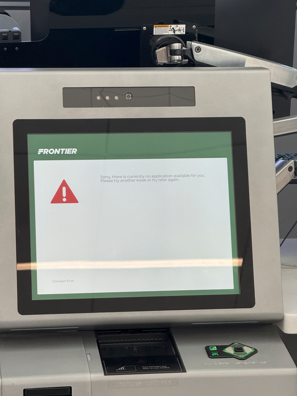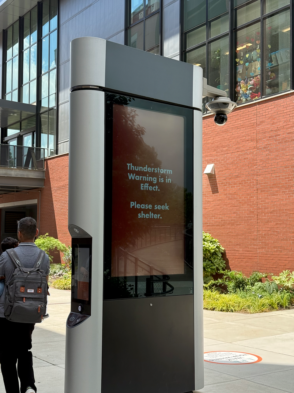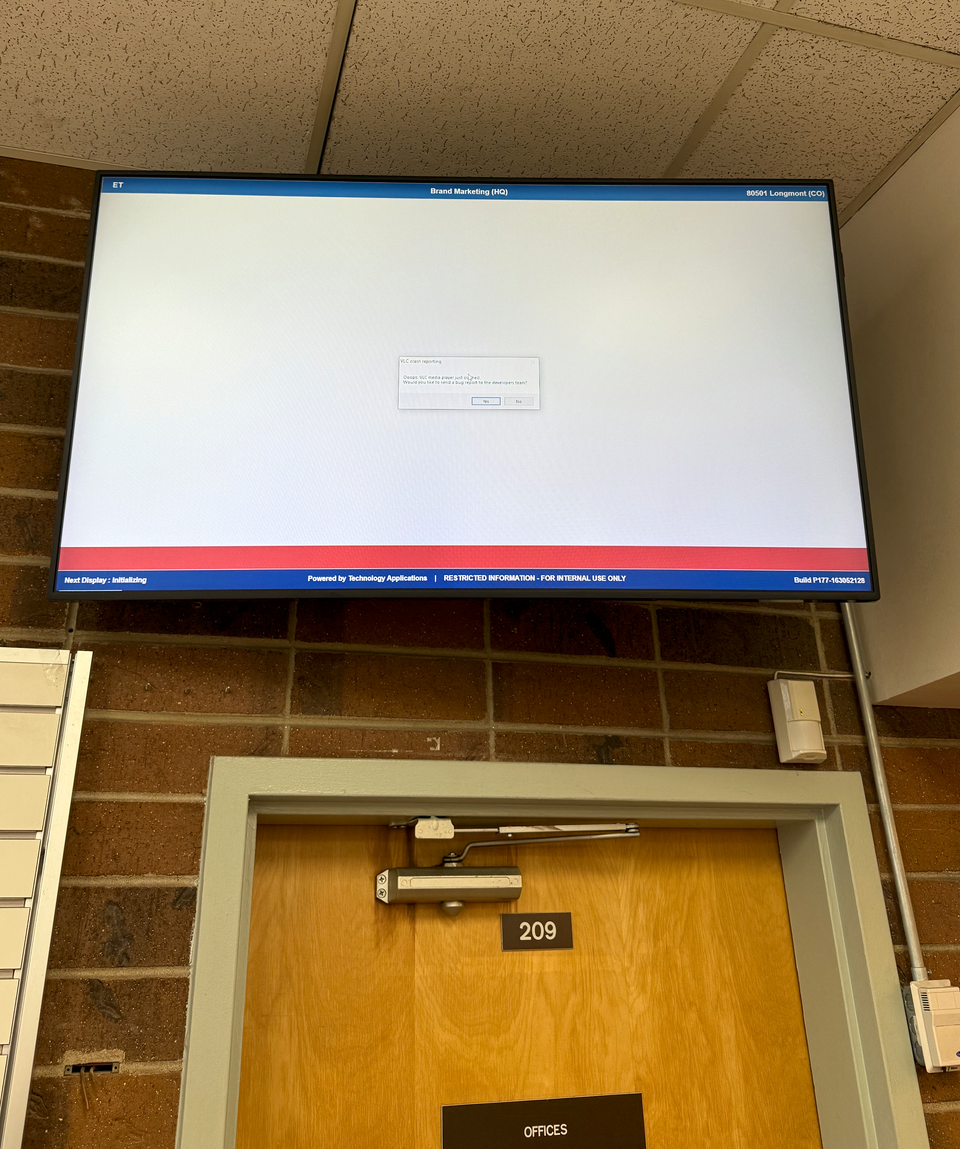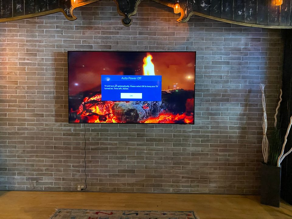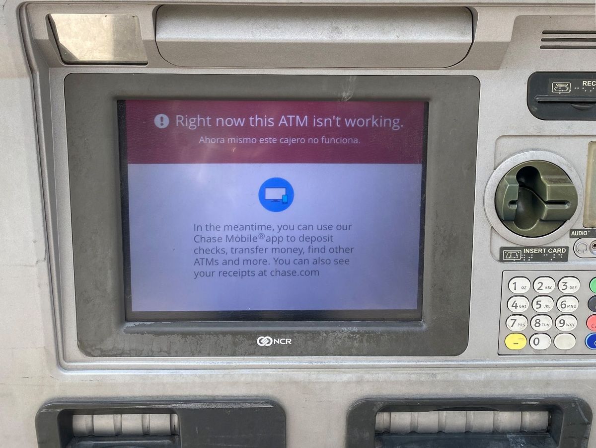
My wife and I debated for some time as to whether this qualified as an error state. “But it’s not entirely broken!” she argued. “But it is!” I countered right back.
Not every error state needs to be an example of something visibly broken. There are good error states. That’s one of the joys of looking out for them: what does the correct way to engage with someone look like, when the thing itself is out of order? Do you tape a piece of paper? Do you design for the error? 404 and 503 screens on websites are good examples of such recurring problems that most website themes have an explicit design for them.
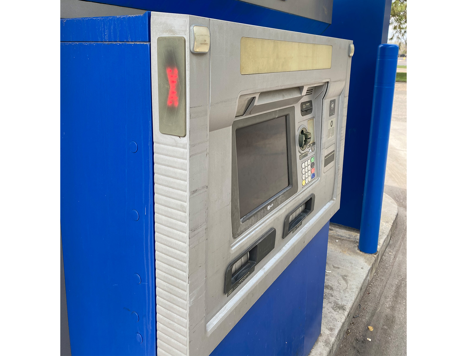
Anyway – I particularly enjoyed seeing something that on the outside looked so dirty and crusty (which I normally would have skipped, but had no choice but to try to use) have a refreshingly working error state. It even had a more analog red “X” on the side (which I entirely missed) to discourage people from driving up.
But still. I needed my money and had to drive another 20 miles to find another Chase bank. So it goes!
